What’s up! Time for another dev update. Today was all about making the website mobile-friendly and giving my Schmo Time show a proper 3D upgrade. Let me walk you through what got done.
Mobile Optimization and Site Structure
First priority was making sure the site actually works on mobile devices. This mostly came down to making sure everything can stack vertically without breaking. I tested everything using Chrome’s phone simulation mode instead of loading it up on an actual phone – it’s pretty sweet because it can emulate tons of different devices and even simulate folding phones and rotation.
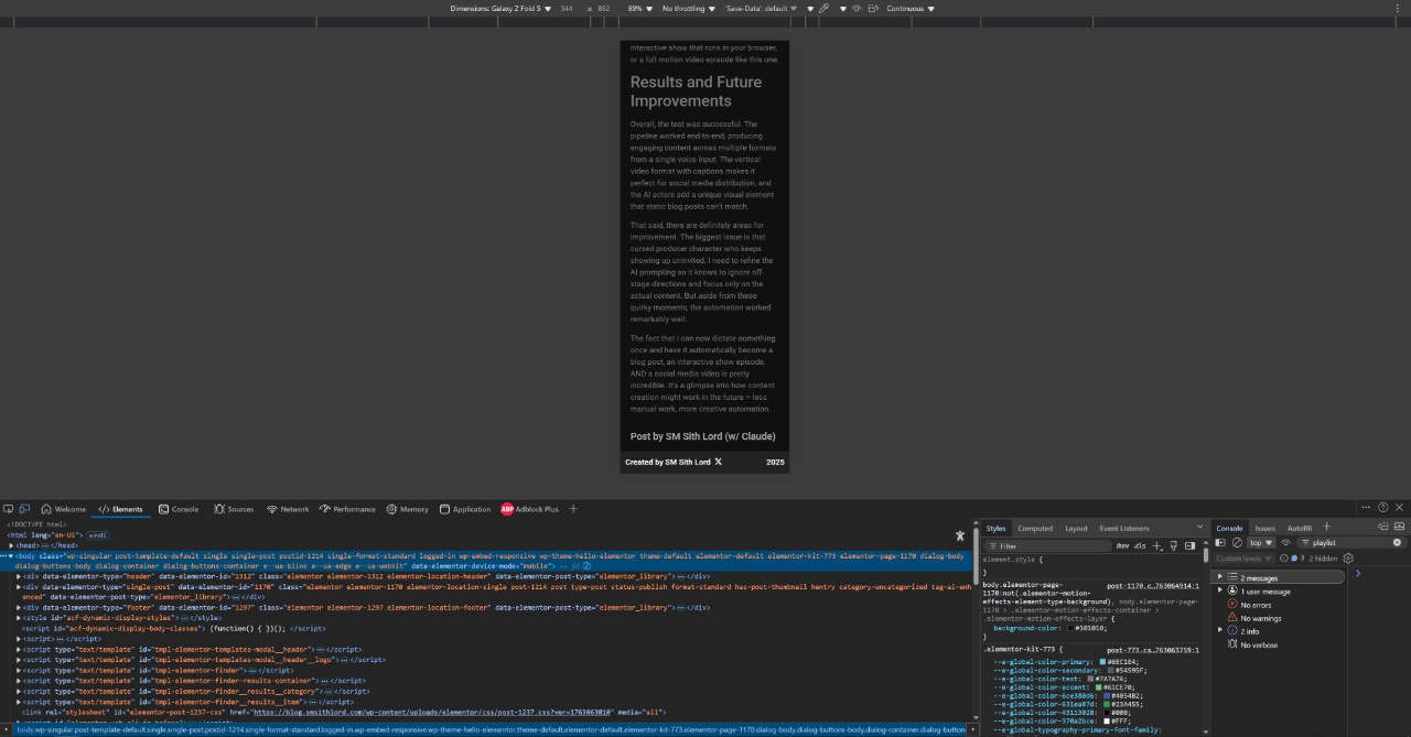
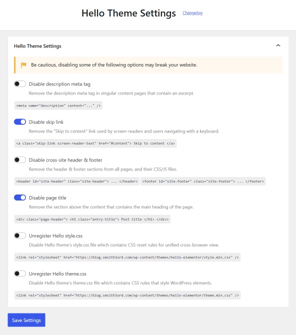
Next up was setting up proper site-wide headers and footers using Elementor. Had to make sure these showed up consistently across all pages, even the old legacy pages that barely get used anymore.
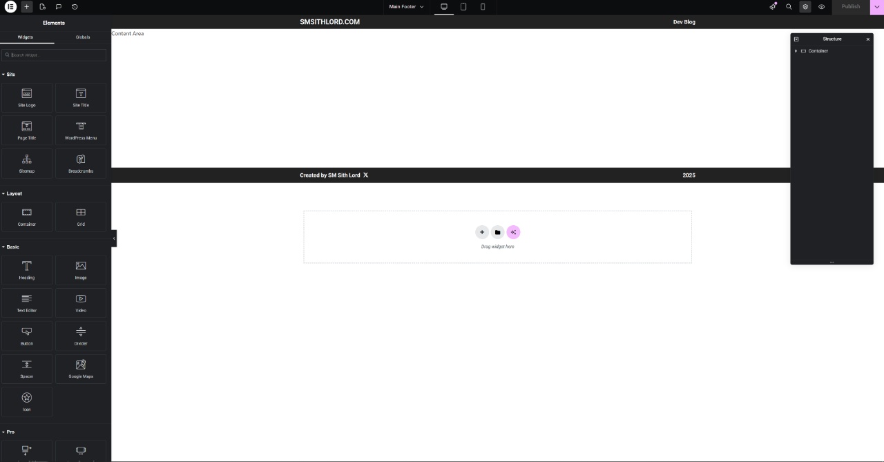
Fun fact: I actually had to enable some “experimental” feature in Elementor to even get the site-wide header and footer options. Always love when basic functionality is locked behind experimental flags!
Schmo Time Integration
The next big task was getting the 2D Schmo Time episodes to automatically embed into blog posts when available. This involved setting up an ACF field to hold the episode URL and some clever CSS with display:none rules and shortcodes to show or hide the embed based on whether a post has an associated episode.
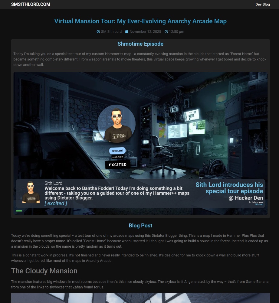
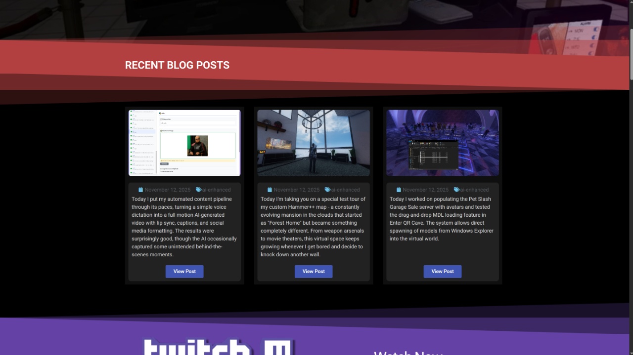
While I was at it, I updated the home page to show recent posts in a nice Elementor carousel with 16:9 image windows. Much cleaner than what was there before.
From 2D to 3D: Enter Banta Fodder
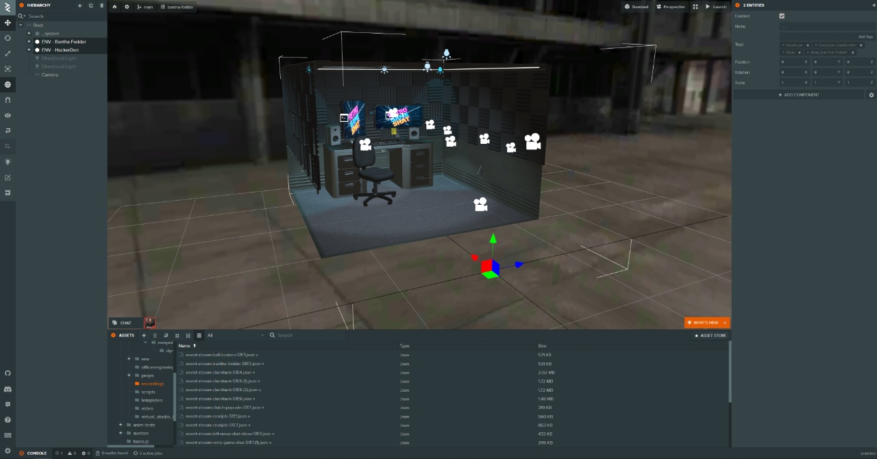
Now that the 2D show was properly integrated, it was time for the main event – creating a 3D version! I cloned my existing “Clutch Pop Win the Pucks” show setup and transformed it into “Banta Fodder” (which is essentially the 3D version of Schmo Time). The 3D version actually runs better than the 2D and fits much better on mobile screens.
The setup in PlayCanvas was surprisingly straightforward. I just had to tell the director that Sith Lord was the host instead of Pucks and make a few other tag changes. Sometimes the simplest solutions are the best ones.
The Final Result
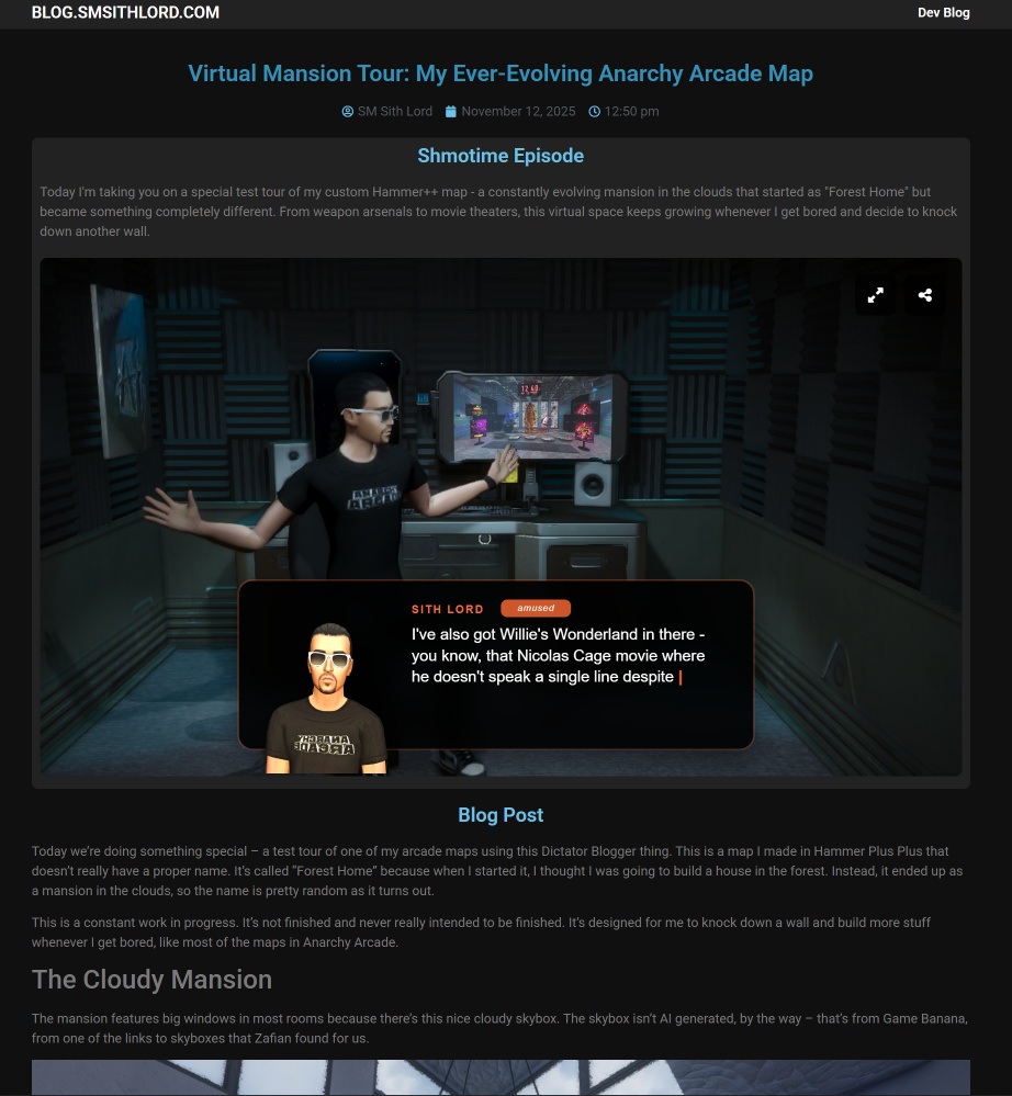
And here’s how it all comes together! The blog now has a proper header, and when a post has an associated Schmo Time episode, the 3D version automatically appears at the top of the post. Below that, you get the regular blog content with all the images and text formatted nicely for mobile.
Pretty solid day of development! The website is now mobile-friendly, has proper structure, and the Schmo Time integration is working seamlessly in both 2D and 3D formats. The next episode will probably be about something completely different – we’ll see what catches my attention next!